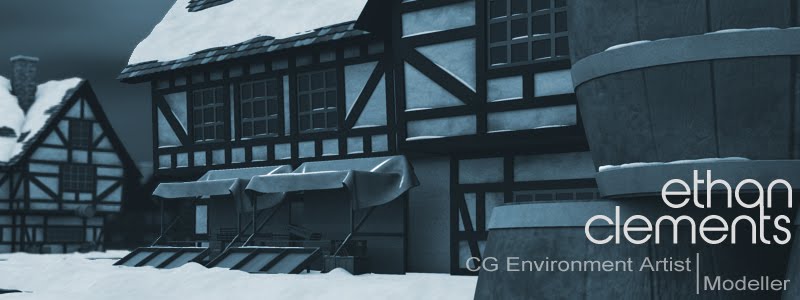
So our crit was on Friday and i received a lot of great feedback in allowing me to kep improving. I fully took on board all of Phil's comments and afterwards i asked Photoshop Phil a few questions about further improving the work. For me there were a few things about the image that stood out, like some of sizes of the textures were too big and the wheelchair seems to look too CG. However, Phil did point out some things that i didn't notice like the flatness of the image. Originally, in my concepts, i has painted trees in the foreground so that you could distinguish a foreground, middleground and back ground. However, the tree on the front right needs to be brought closer to the camera so you get more of an overall environment insted of that flatness. It needed to be slightly more layered, which is possibly why it looks so painterly, but i was also going for quite a theatrical look so i think that painterly style became part of that effect. Overall, i feel this was my favourite and best piece of work i've produced on the course so far, but there is definitely more to come and i feel i'm learning more and improving in each unit.

No comments:
Post a Comment